CSS Display and Positioning
What You Need to Know:
- HTML Basics
- CSS Basics
What you will Learn:
- How to use inline-block, block and inline
- How to use float properties
- How to use clear property
- When to use the clearfix class
- How to use the different position properties: relative, absolute, and fixed
Why This is Important:
So far, all we’ve been able to do is put content on a page with HTML to make some ugly looking websites. So how do we actually make our sites stuff look good? CSS! CSS stands for Cascading Style Sheets. We write CSS in separate files, so that each file of our web site does one job and one job only.
You’ve seen how to select and style individual CSS elements. Now, we’ll look at how to position elements on the page.
Positioning is tricky - the view window isn’t always the same size, and elements often need to change size and position relative to each other and to the window.
Empire State Code Along:
Fork and Clone this Lab and follow along while your instructor codes. https://github.com/google-cssi/hs-empire-state-css-challenge
Display and Positioning
This section covers some of the least intuitive parts of CSS. Buckle your seatbelts.
Display
The display property has many possible settings. The most commonly used are none, inline, block, and inline-block.
display: none;
As you might expect, this setting means that the block is not displayed on the page at all.
display: inline;
An element with display: inline; takes up no more space than is necessary to cover its content. If there are multiple elements whose display is set to inline, they will share the same line. Here is a list of all the elements whose display property defaults to inline; the most common are <a>, <br>, and <span>, as well as all of the form elements (<input>, <textarea>, <button>, etc.).
display: block;
An element with display: block; will automatically take up the entire line if no width is set (even if the content doesn’t take up the whole line). An element whose display is set to block will take up the whole line Here is a list of all the elements whose display property defaults to block; the most common are <div>, <p>, <ul>, <ol>, all the headings, <article>, <section>, and <nav>.
display: inline-block;
An element with display: inline-block; shares some of both properties. It sets its width and height in the same way as block, but can exist on the same line as other elements. There are no tags that default to inline-block.
Examples
Here is some HTML and CSS for two elements. Below you can see an example of what happens with the elements when their display property is set to inline, block, and inline-block, respectively.
<!-- HTML -->
<div class="red">This is the first element.</div>
<div class="green">This is the second element.</div>

/* CSS */
div.red {
  background: red;
  width: 100px;
}

div.green {
  background: green;
  width: 100px;
}

Complete exercises 4-6 on Display Property:
https://github.com/victoria/advanced-css-review
Position
The position property has four possible values: static, relative, absolute, and fixed. By default, all elements have position: static;.
position: relative;
An element with position: relative; takes up space as you would expect in the normal flow of the page, but you can then move it using the top, bottom, left, and right properties, usually measured in pixels. It is moved relative to where it would have otherwise been on the page.
Example:
<!-- HTML -->
<section>
   <div></div>
</section>

/* CSS */
section {
   border: 2px solid black;
   width: 100px;
}

div {
   position: relative;
   height: 100px;
   width: 100px;
   top: 150px;
   left: 300px;
   background: green;
}
We get:

position: absolute;
An object with position: absolute; does not take up space in the normal flow of objects.
Example:
<!-- HTML →
<div></div>
<p>Lorem ipsum dolor sit amet, consectetur adipisicing elit, sed do eiusmod tempor incididunt ut labore et dolore magna aliqua. Ut enim ad minim veniam, quis nostrud exercitation ullamco laboris nisi ut aliquip ex ea commodo consequat. Duis aute irure dolor in reprehenderit in voluptate velit esse cillum dolore eu fugiat nulla pariatur. Excepteur sint occaecat cupidatat non proident, sunt in culpa qui officia deserunt mollit anim id est laborum.</p> <!-- random text -->

/* CSS */
div {
  position: absolute;
  top: 20px;
  right: 150px;
  width: 100px;
  height: 100px;
  background: blue;
}
We get:

Pro-tip: If you use position: absolute; on an element, always set position: relative; for the element’s parent. This will help prevent surprises with positioning in differently-sized windows and shouldn’t affect how the parent renders at all.
position: fixed;
An element with position: fixed; does not take up space in the normal flow of objects. It is very similar to position: absolute; except for one key feature: it will always stay in the exact same place in the window, even if you scroll in any direction. This makes it a popular choice for headers (and sometimes footers) if you want them to follow the user around the page.
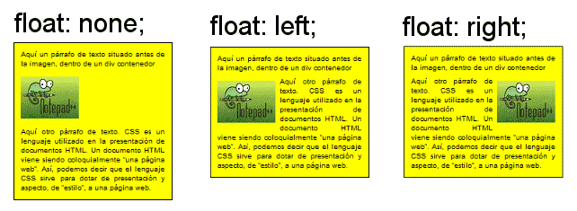
Float
Elements can given the display property float, which can be set to left, right, or none. By default the float property is set to none. If float is set to left, the element will automatically “float” up and to the left until it hits either the edge of its parent element or the edge of another element with float: left; (the rule is similar for float: right;).
Example:
<!-- HTML -->
<section>
   <div style="background: red"></div>
   <div style="background: green"></div>
   <div style="background: blue"></div>
   <div style="background: orange"></div>
   <div style="background: purple"></div>
</section>
<!-- NOTE: In general, it’s bad practice to use the ‘style’ attribute; you should use CSS instead. We’re using it here for conciseness. -->

/* CSS */
section {
  width: 300px;
  height: 500px;
  border: 2px solid black;
}
Clear Property
Say we have an element we have floated, and another non-floating element that we want to appear below the first:
<!-- HTML -->
<div></div>
<section></section>

/* CSS */
div {
  float: right;
  height: 100px;
  width: 100px;
  background: blue;
}

section {
  height: 300px;
  background: orange;
}
Looks good, but what do we get?

Uh oh, we wanted the orange box below the blue box, not behind. It turns out that blocks that are floated take up no space in relation to elements that are not floated.
Luckily for us, we have the property clear which will tell the non-floating elements to “clear” (i.e., appear below) our floating blocks. We can give them the option to clear: left; (only clear the blocks floated left), clear: right; (only clear the blocks floated right), or clear: both; (clear all floating blocks).
So, change our CSS:
section {
  …
  clear: both;
}
And we get:

Activity: Fansite
Open your celebrity_style.css file:

Clearfix Class
Here’s an example of a common CSS problem. We want to put, say, a picture and a block of text and have them float next to each other inside another block (we’ll make it pink with an orange border). Here’s our code:
<!-- HTML -->
<section>
  <div>:)</div>
  <p>Here is a lovely example of text.</p>
</section>

/* CSS */
section {
  border: 2px solid orange;
  background: pink;
}

div {
  float: left;
  font-size: 100px;
  background: # fff;
  border: 1px solid black;
  padding: 0 20px 20px 20px;
  margin: 10px;
}

p {
  float: left;
  padding: 20px
}
The code looks great! But here’s what we get:

What happened to our pink background box? Well, it turns out that when you float an element, it no longer takes up space in its parent element. So in our example above, the <section> element collapsed to its minimum height, rendering only the border as a single orange line.
How do we fix this? One option is to hard-code in a height for the <section>. This could be ok if we only ever use the <section> in this particular context, but what if the text or picture changes? Maybe for some people we want the text to be paragraphs and paragraphs long, and for others we want it to be only a few words. It would be much better if we could find a way for the <section> to take up exactly as much space as needed to wrap around its contents.
The solution to this is creating a “clearfix” class. To use it we need a very special block of CSS:
.clearfix:after {
  display: block;
  clear: both;
}
What this is saying is that, for every element with class=”clearfix”, after all its child elements we insert a block with no real content that clears everything floated on both sides.
Now, just add the above to our CSS and change our HTML like so:
<section class="clearfix">
   …
</section>
And voilá!

Conclusion
Display and Positioning properties allow you to control the layout of your webpage!